Archive for February 2013

Pre-launching Béance

1 Comment »


Hi guys! I'm here making a special announcement, I usually write on Mondays about tutorials and personal experiences, now today I'm going to tell you some details about my new Webcomic Béance, you will start to enjoy in early march.

Plot


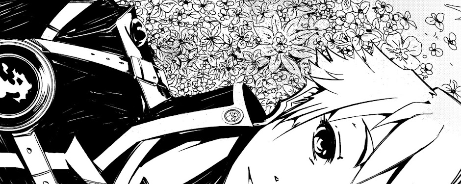
Béance is the story of two guys, a young thief called Griv, he has a lot of problems making friends as he is a pretty violent and impulsive, but there's one person that will change that, his name is Guido a mysterious youngster who Griv saved many years ago when they both were children, and become his friend and protector. They both are living in a big city named by Odora, a city divided by three big stone belts and most of the poor and humble people are living in the bottom of the city, where sunlight can not reach. The two thieves are trying to recover what those people have lost in the darkness, but there are people who will try to keep things as they are and hide the origin of this controversial city.

Concept behind Béance


When I wanted to write Béance the first thing that came to my mind was "Thieves! I need thieves! That would be epic!" I was exploring the Idea of "Hey, why I would make a thief a hero? or why robbing someone is a good action to become a hero?" well, that's the emotion behind stealing something that means something for a person, behind an object or a feeling you can find a lot of things, is not the story of the stolen things, is the story for a stolen and strong feeling. "How can you feel if someone steals your heart n front of you?" Awkward question isn't it?

Becoming a person who steals gold and delivers it to people is not the main idea of Béance, you will see more action, more emotions and a the difference between having something and not to have it, as simple as that but is deeper than it sounds. "Watch out! It is the boy!!"


Concept behind the characters


One of the first things I want to talk about is Why two main characters? In most of the series there are one protagonist e.g. Naruto, Bleach, Superman, Batman, Dragon Ball Z. In this case this is story reveals how two very different people can have a really special bond and destiny. Guido really needed someone to help him, in that case Griv appeared to save him in that moment and also his salvation for life, with a guidance, a model to follow, even if he's not the best person in the world but he's actually your saviour and your friend, that makes you thing that you can amend mistakes from the past, create a new life with new good things and new problems too.

Griv, he's maybe the solution and also the problem in Béance, creating a person who is part of the main problem and believes that doing things his way will resolve everything, but that's actually a lie. Guido, he can be a really nice person, but he's actually a dangerous person in the shadows, the truth about Guido will remain only in his lost heart, no one know who was he before he met Griv.

Publication


- Béance is a project written and drawn by Rizian Larc, and published by Noktos.

- You can read the Webcomic in a Website that will be launched in Early March.

- You can read there Two pages per week.

- When a volume is complete you can buy a printed edition for you.

- You can stay tuned in Béance's Fan Page on Facebook for news and other cool resources.


And we will have... Victory - Lord Béance.

Photoshop VS Paint Tool SAI

3 Comments »

Hi guys! It's Monday, so today I'm going to write a new review about some drawing software I've been using since one year, what I'm telling you here is about my own experience, other people can have their own, but I'll show you a little review and the pros and cons for Adobe Photoshop and Paint Tool SAI.

Adobe Photoshop 

Well, to start we must talk first about one of the most used software for Digital artwork, it has a lot of tools and uses, so you can find here everything, I really mean it, everything!! You can adjust the default brushes, add your own, use blender, manipulate light and shadows in your paintings, change colours, manipulate photos and add the little final details to your artwork. It is a very complete software, but that's the bad point in Photoshop, you need to take your time to learn to use all the options and tools available, there are so many tools that you can be a little stressed when using Photoshop for the first time.

Pros:

- Very useful and versatile for Drawing or Painting.
- You can create your own Brushes or Download some cool brushes in a lot of Websites.
- You can have every tool in the same program, you can easily do a complete piece only using Photoshop.
- On the internet you can always find a lot of tutorials of how to use this program.
- You can create your own shortcuts, and modify the default actions, so this can be really helpful and can save you a lot of time when working.
- The selection tools are more reliable in Photoshop than in other Programs.
- You can easily edit a scanned draw in Photoshop.
- It is compatible with a lot of formats like PDF, JPEG, GIF, PNG, TIF, and others.

Cons: 

- At the beginning is really hard to get used to all the tools, so you have to go slow and have tons of patience.
- This program is a nightmare for slow computers, it needs a lot of resources from the computer to work with it.
- Most of the people give up when trying to learn Photoshop, so they start drawing or painting in other programs.

Paint Tool SAI

Paint Tool SAI is for me one of the easiest and simple Drawing software I ever used, because it shows only the important tools to make a draw or a painted artwork, you can easily customize the tools with a simple Double click. The bad thing is that most of the people needs to open Photoshop to add the finishing touches to their artwork, or just to add text to the image.

Pros:

- It is really a really simple Software, so you can memorize the tools more easily than other programs.
- You can customize the available tools, create shorcuts and rename the tools, only by Double-clicking the Tool you want to change.
- It may not be compatible with a lot of formats as Photoshop is, but it has the most used formats in Digital art.
- It is a very light program, you do not need a very fast Computer or the best of the Graphic cards to work in excellent conditions.
- It has better selection tools than Photoshop.
- The Lineart layer add some cool tools for fixing little details in lines and a very interesting tool to create Vectors and modify them.
- This is a very popular software between people who draw/paint Manga or Anime style. So you can give it a try to this powerful Japanese Tool.

Cons:

- This software has no Text tool.
- You can't modify colours, light and shadows as easy as Photoshop does.
- The brushes are very limited, you can create your owns, but in "available forms" you will have a limit.
- You can find some resources for this software but not as many as Photoshop.

So, that's my opinion about these two great programs, I usually use both, because I just can't find perfection in just one. You can make your own conclusions, remember this is only my opinion. So I hope this review was useful to you, I'll be back the next Monday with a new post in the Blog! Have a nice day!

Previous Posts:

Manga Studio 5 Review
Tutorial: Draw Women Hair
12 Tips for Webcomic Beginners
Tutorial: Create Scenery/Background
How to get used to your Tablet
Improve your sketch abilities in 10 steps

Asada Hiroyuki, one of my inspirations

No Comments »

Hi guys! It's Monday! For some people the worst day of the week, but for me it's one of the most cool days, so let's get to the business! Today I'm going to write something about a pretty important influence to me and my art, his name is Asada Hiroyuki, a Japanese Manga artist, he's currently working in the manga series Tegami Bachi for Shueshia, Inc.

Hiroyuki Sensei's Desk and Tegami Bachi artwork. Source: www.asadahiroyuki.com
The feeling from the art he does is really amazing when you see his art you can feel a mix of sadness and a deep sense of good energy, his art is incredibly detailed and has a incredible composition on it.

His remarkable art makes him (for me) one of the best Mangakas in Japan, he has been even linked to Takeshi Obata and Death note's artwork. But overall, all his manga series were serialized in the Monthly magazines from Shueshia, inc.

I met his art when I read Tegami Bachi for the first time, I said: "Wow, this guy has a pretty clean art, it is really impressive!" Well, his inking skills were the things that got me in first, but now I look at his coloured artwork and I went really crazy, he has a powerful concept around colour. He usually uses a mix of warm and cold colours, when you see a yellow character or a red painted character from him you could somehow see some cold aura around that character. That's pretty enigmatic and one of the things that captured me from his art.

Boy and a Raccoon by Asada Hiroyuki. Source: http://gallery.minitokyo.net/view/565936
He's got a knife by Asada Hiroyuki. Source: http://gallery.minitokyo.net/view/566052
The respect I got towards him is massive, in some way he made me think "God, I want start my own Manga series", and obviously he has influenced my art. I invite you to see more from his amazing artwork on his Official Website or just read some of his Manga series like Tegami Bachi or I'll. He inspired me to become a better artist each day, when I see his artwork I think a lot about what I'm going to do next to reach somehow his level, that's one of the Manga artists I want to know someday, for sure!

Thank you a lot for reading this article! I hope this have been useful and interesting for you! Remember I'm writing a new each Monday and uploading some cool draws and resources on my Facebook Fan Page. Have a nice day!

Previous Posts:

Tutorial: Draw Women Hair
12 Tips for Webcomic Beginners
Tutorial: Create Scenery/Background
How to get used to your Tablet
Improve your sketch abilities in 10 steps

Manga Studio 5 Review

14 Comments »


Hi guys! It's been some few days since the last entry, I know today is not Monday, but I wanted to write this  article about my thoughts on the new Manga Studio 5 from the company Smith Micro, Inc.

The first thing I thought when I opened the program was: "Whoa! It changed a lot from last version, such an amazing change and has a nice and clean interface. It surely looks more friendly". And well to be honest what I thought on the beginning is becoming better and better while I'm testing the tools and the markers.

Most of the content is still being the same, but in the tool bar you can look at the new brushes preview, get more information about the pressure, density, texture and other cool features. The brushes look even better than in last version. It feels more like drawing on a real paper sheet with a real pencil, so that's one of the things that really got me, because I do a lot of sketches, so I need a good pencil tool to doing it, for now I can say the pencil tool in the new Manga Studio 5 is the best one I've ever used!

What I did not like in Manga Studio EX 4.0 was the horrible interface, It looked like some old drawing software, the tool bars were not as clear as the new ones. The program looked more for an engineer rather for an artist.

Here are my pros and cons about the new Manga Studio 5:

Pros:

- The pencil tool has a really good feel, it is like using a real pencil on a real paper.
- The brushes are more organized and have a little preview, so you can compare with others before clicking on one.
Attractive interface, it looks modern and soft, the program looks less stressing with this new interface.
- For me that I run the program on Windows, it is a really fast program, the older version gave me one or two problems when the screen was frozen, or I couldn't use Photoshop and Manga Studio EX 4.0 at the same time.
- The preview of the tones is really awesome, you can see the tones clearly and separated in themes.
- There are some cool resources, the new poses and beginner's assistant are really good for people to get in touch with the program.

Cons:

- No font preview, that's really a shame, you need to pick and pick a font to get the one you want, not like in programs like word that you can see a little preview.
- It is harder to find the "Panel creator" or the tool to put panels. I had to search for a tutorial on Youtube for this, you can see it here.
- I don't know if it is only me, but the program looks a little like Paint Tool SAI.
- God please, It is really addictive!!

So for now that's my view about the new Manga Studio 5. I hope you liked it, if you have any thoughts about your experience in this new program I'd love to read your comments! So, that's for now! We will see soon on Monday with a new entry! Have a nice Weekend!

I invite you to read my Webcomic Ereggia, I'm doing this Webcomic using Manga Studio!

To see more drawings from Manga Studio 5 or other related artwork from Rizian Larc you can take a look to the Facebook Fan Page or Twitter Account!

Previous Posts:

Tutorial: Draw Women Hair
12 Tips for Webcomic Beginners
Tutorial: Create Scenery/Background
How to get used to your Tablet
Improve your sketch abilities in 10 steps

Tutorial: Draw women hair

No Comments »


Hey guys! It's been a week since the last entry! Now this one will be a Tutorial about Drawing Women hair! I'm going to show you some basic shapes, where to put the hair, how hair works and how to sketch in a easy way the movement of hair. Let's do this!

For first step in this tutorial we will need to draw some faces, so we can start to work on this:

OK, there are our faces, front view and side view, now in the second part we can see in blue lines the marked area of hair source. This is a guide about from where the hair comes from. so let´s continue with this:

So now in the Third step we have to make some lines outside the head to mark where will be the limits of the hair (Points 1, 2 and 3). Now in point number 4 look at the arrow, this will be the source point of your hair, from this you can start drawing the limits of the hair as seen on the Fourth Step. Always try to add lines starting from point number 4, always depending on the place you've drawn it, it can give more realism to the hair, so we can start to add more lines and detail the front part of the hair:

Now at the Fifth step we must add a line where the front hair will be (point 1) and like I said before, adding more lines in the hair direction (point 2) will give more realism to it. In the Sixth step we must add the lines to detail more the hair, always remember to guide yourself by the source point. The number of lines is always up to you, but remember to detail the hair as most as you can to give it more realism.

And for finishing, let's take a look at some Hair movement.

Always try to remember the direction and the forces of the wind, that's one of the things that affects the most when drawing hair comes out, it takes some practice to understand some movements and adding dynamism to the hair you're drawing. Always take some references about hair, if you want to try something weird, do it but... it can sound a little bit boring, but try to learn the most normal hair styles first, so you can use that to create your own and add more personality to your characters.

I hope you liked this tutorial! I'll be back with a new article the next week, so I'll be on Social Media adding some cool things and some process about my related work! See you soon!

Previous Posts:

Composition and Dynamism in Scenery/Backgrounds
Tutorial: Create Scenery/Background
How I've improved in 8 months
How to get used to your Tablet
Improve your sketch abilities in 10 steps